Identity Design
This page features a sample of the variety of graphic identity materials - logos, business cards, stationery, signage,
and websites - Ioana has designed for both non-profit and for-profit businesses and organizations.
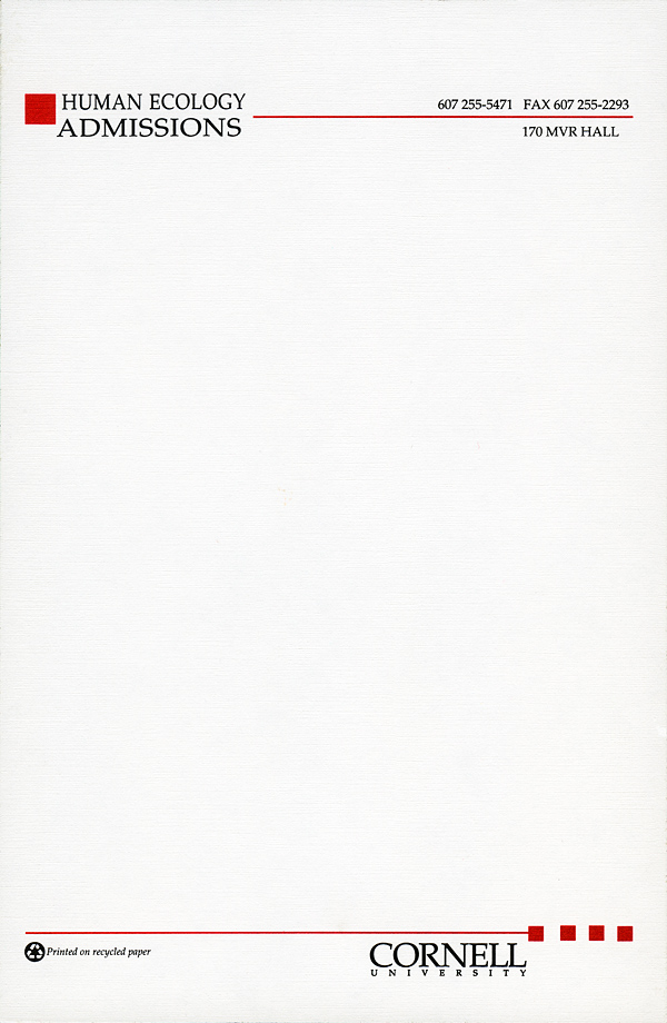
Started at Cornell University on the design of college stationary (as a contractor), the venture was restarted years later when
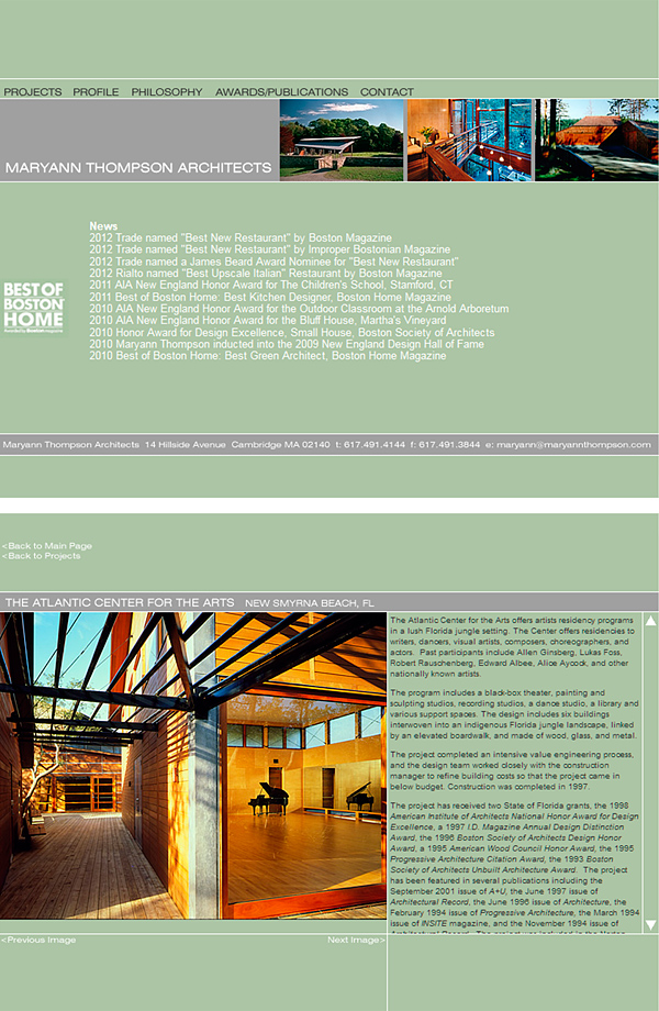
Maryann Thompson opened her new architecture office and needed a new identity.
Requests from other businesses followed.
The main ingredient in the logos - the letters, in a particular font and case (upper or lower) - was carefully chosen from hundreds of options, based on:
- · The image the company wanted to project, and the clients it wanted to attract
- · The forms of the letters and how they interact figuratively (round letters next to angled or straight letters)
- · Legibility at a variety of scales, particularly very small
IDENTITY DESIGN
Logos, Business Cards, Stationery, Signage,
& Websites
For
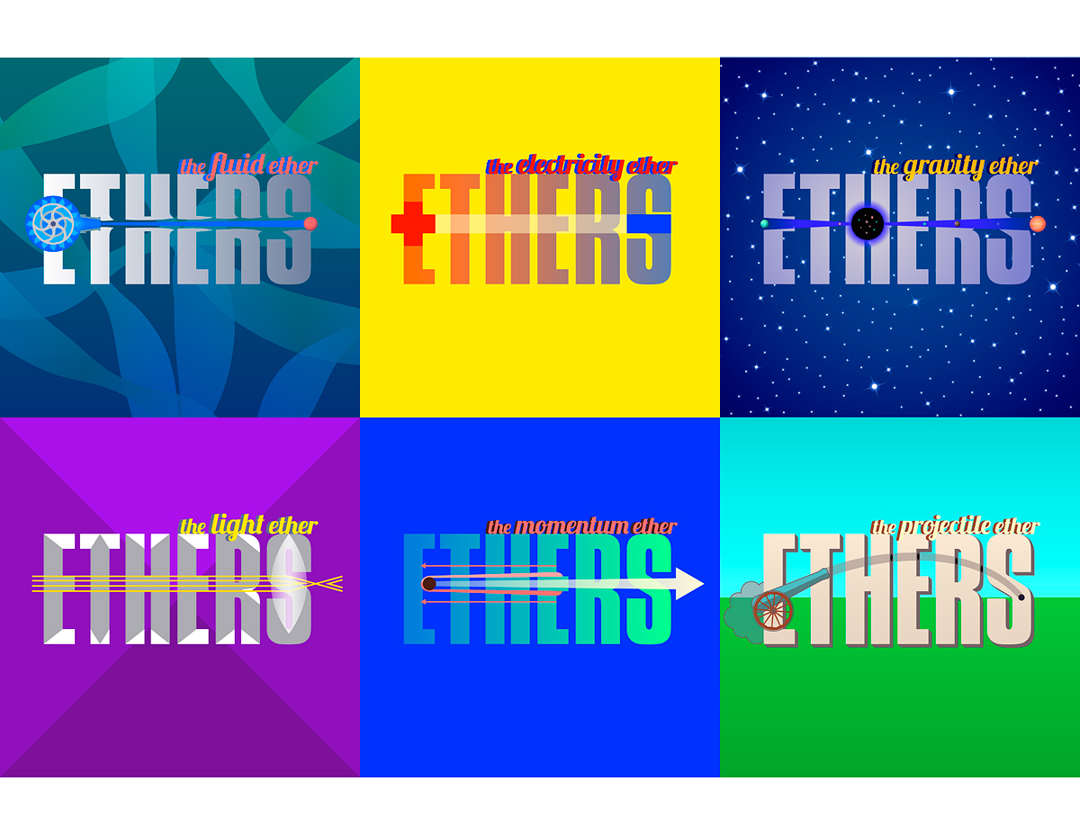
- + Iridescent (Curiosity Machine, Iridescent, Technovation, World of Ethers)
- + USC Engineering (Megacities)
- + Bogdan Urma Photography
- + Carbonell (Architecture)
- + Long Beach Gas & Oil
- + Factual (Tech)
- + Cornell University (College of Human Ecology)
- + Maryann Thompson Architects
- + Private
This page features a sample of the variety of graphic identity materials - logos, business cards, stationery, signage,
and websites - Ioana has designed for both non-profit and for-profit businesses and organizations.
Started at Cornell University on the design of college stationary (as a contractor), the venture was restarted years later when
Maryann Thompson opened her new architecture office and needed a new identity.
Requests from other businesses followed.


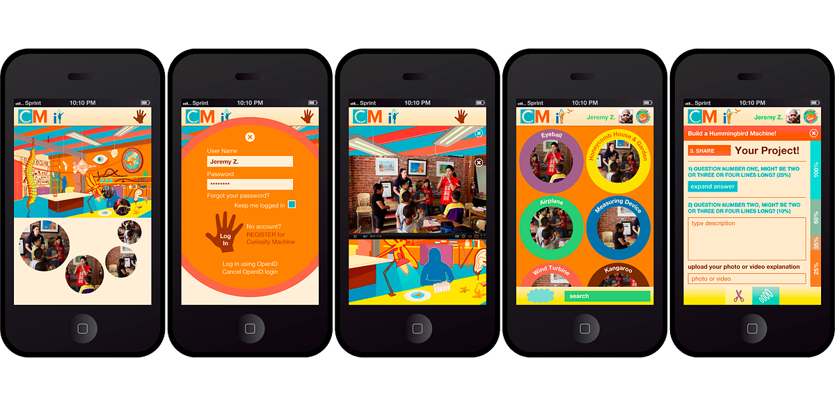
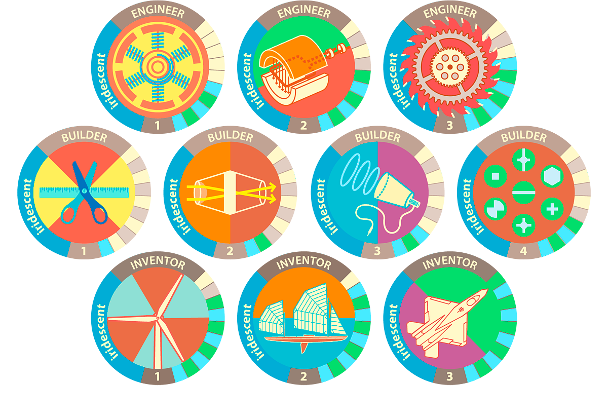
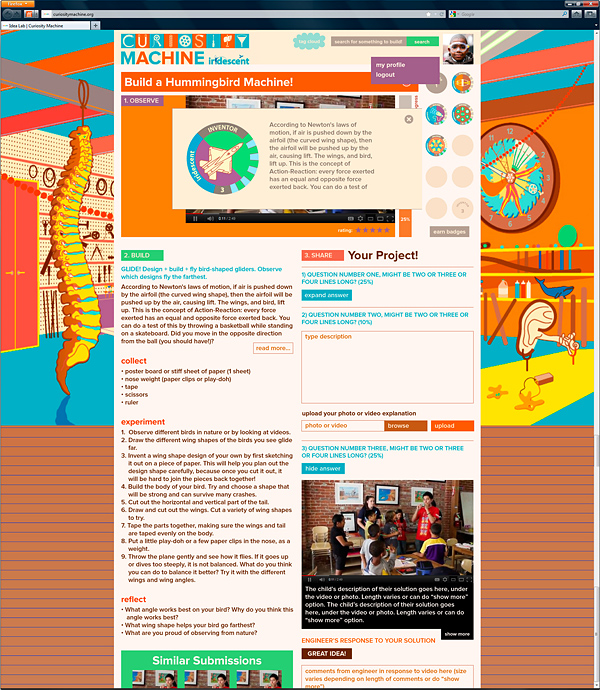
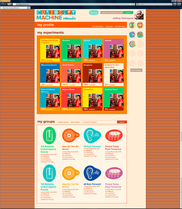
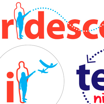
The Curiosity Machine online STEM program required a complex identity package, including logo, website design, phone app design,
and multiple other parts and marketing materials.
The Curiosity Machine online STEM program required a complex identity package, including logo, website design, phone app design,
and multiple other parts and marketing materials.
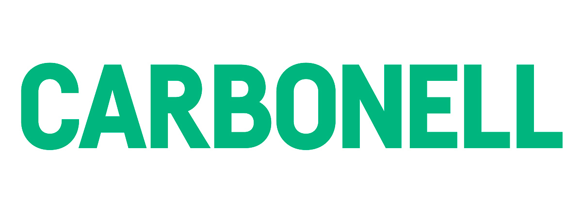
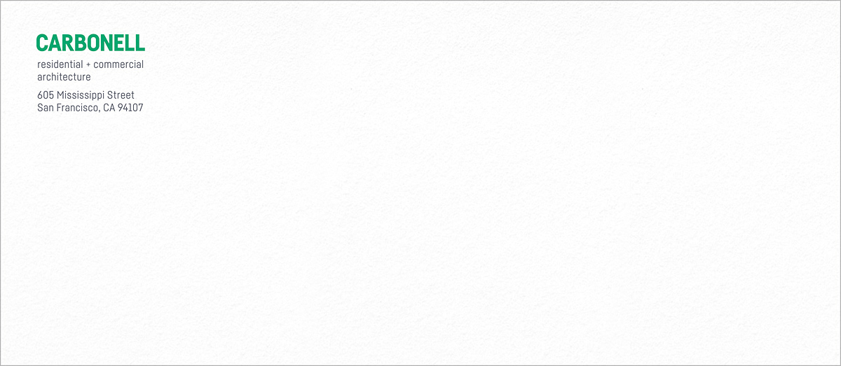
The interactions between the “GA” in MEGACITIES (above), the “GD” in BOGDAN (below), and the “CA” in CARBONELL (below) were crucial to the selection of the fonts.
The main ingredient in the logos - the letters, in a particular font and case (upper or lower) - was carefully chosen from hundreds of options, based on:
- · The image the company wanted to project, and the clients it wanted to attract
- · The forms of the letters and how they interact figuratively (round letters next to angled or straight letters)
- · Legibility at a variety of scales, particularly very small
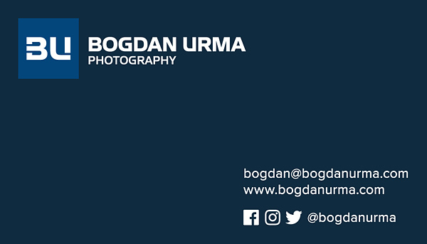
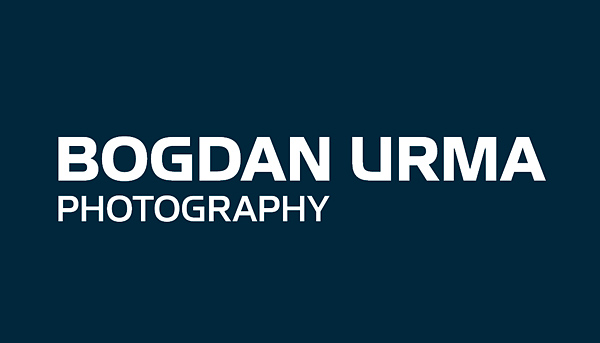


The interactions between the “GA” in MEGACITIES (above), the “GD” in BOGDAN (above), and the “CA” in CARBONELL (below) were crucial to the selection of the fonts.
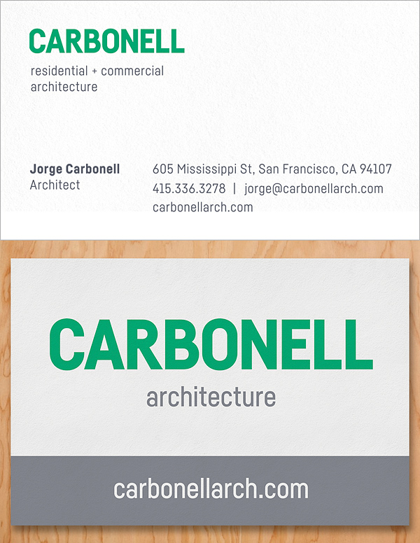

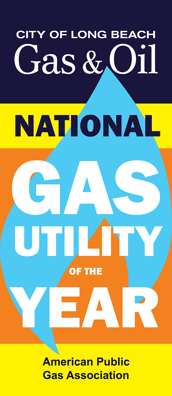
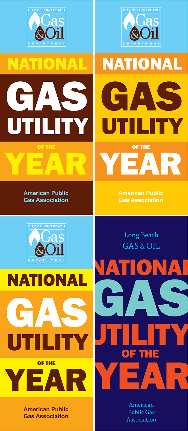
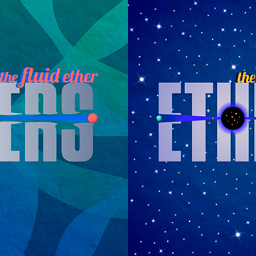
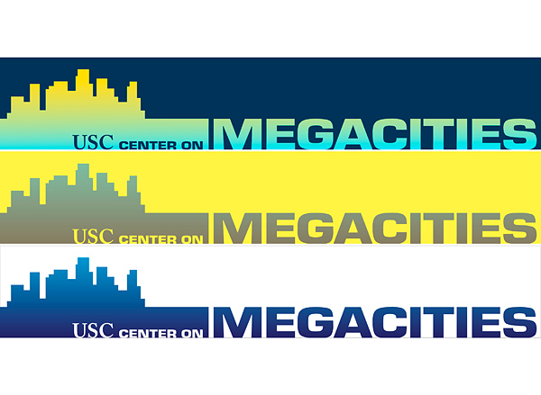
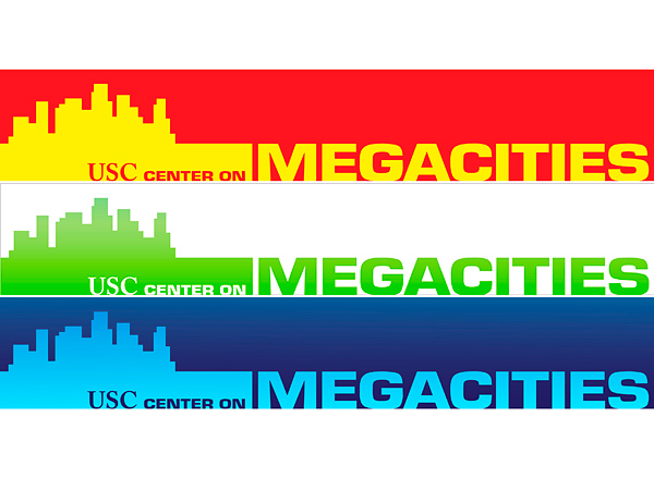
The designs vary from very minimal to very colorful, depending on the client, their work, and their target audience.
The designs vary from very minimal to very colorful, depending on the client, their work, and their target audience.




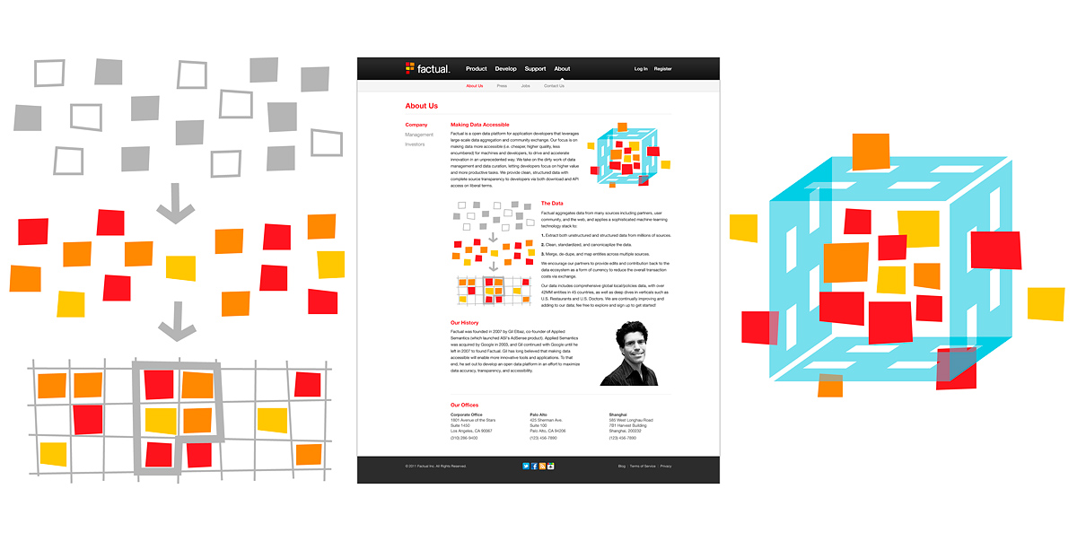
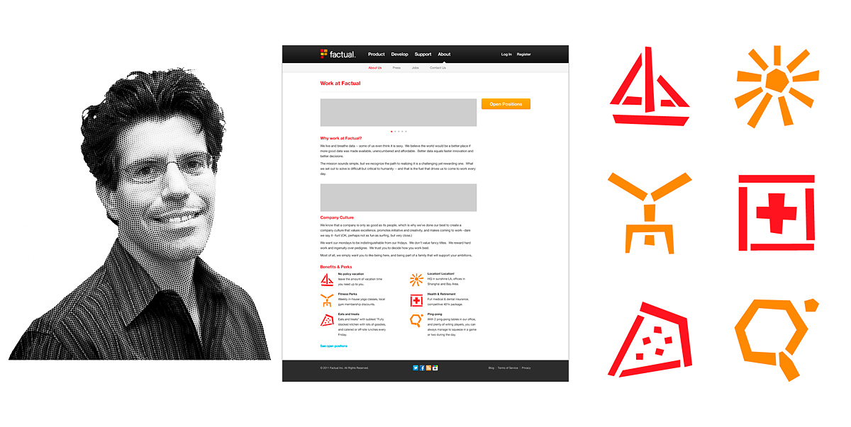
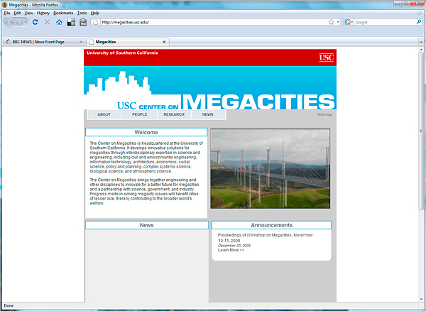
When designing for companies with an existing logo (partly branded), such as creating the website graphics above,
Ioana made sure that the style of the new designs fit the existing visual identity.
When designing for companies with an existing logo (partly branded), such as creating the website graphics above,
Ioana made sure that the style of the new designs fit the existing visual identity.

Work/Credits
Design: Ioana Urma.
